Reproducibility
I list below the R packages required to reproduce the analyses.
Except stated otherwise, all correlation matrices have been computed using Pearson Correlation, provided by the stats::cor function.
Compute Drug-drug Similarities
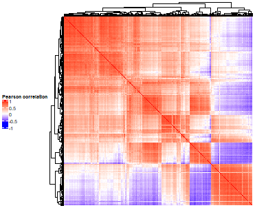
Drug By Drug Heatmaps
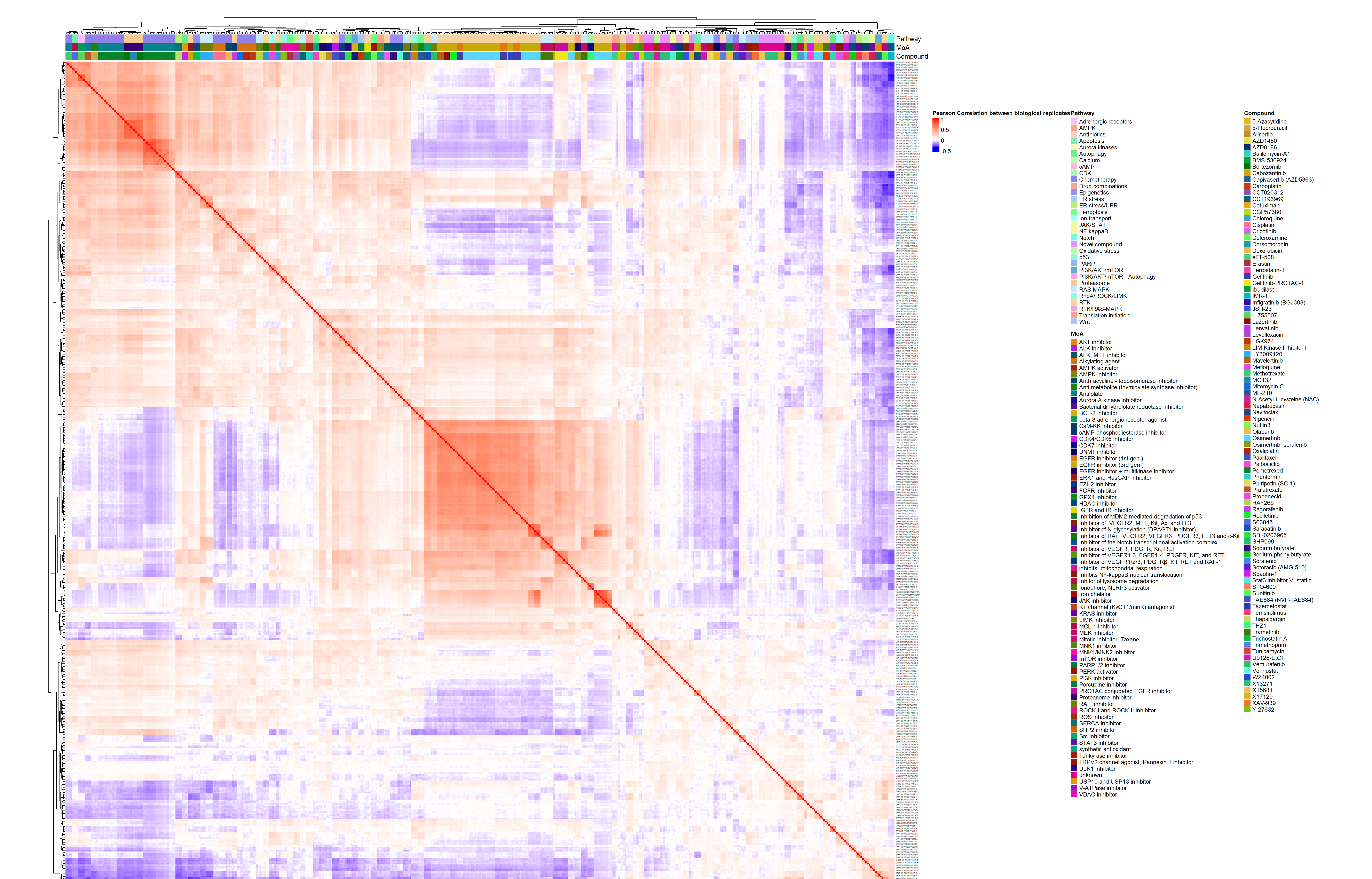
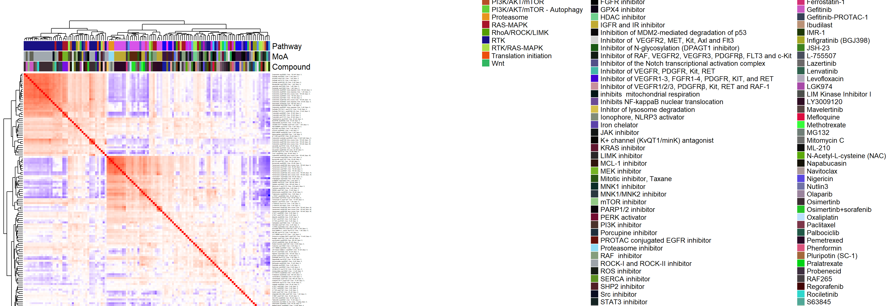
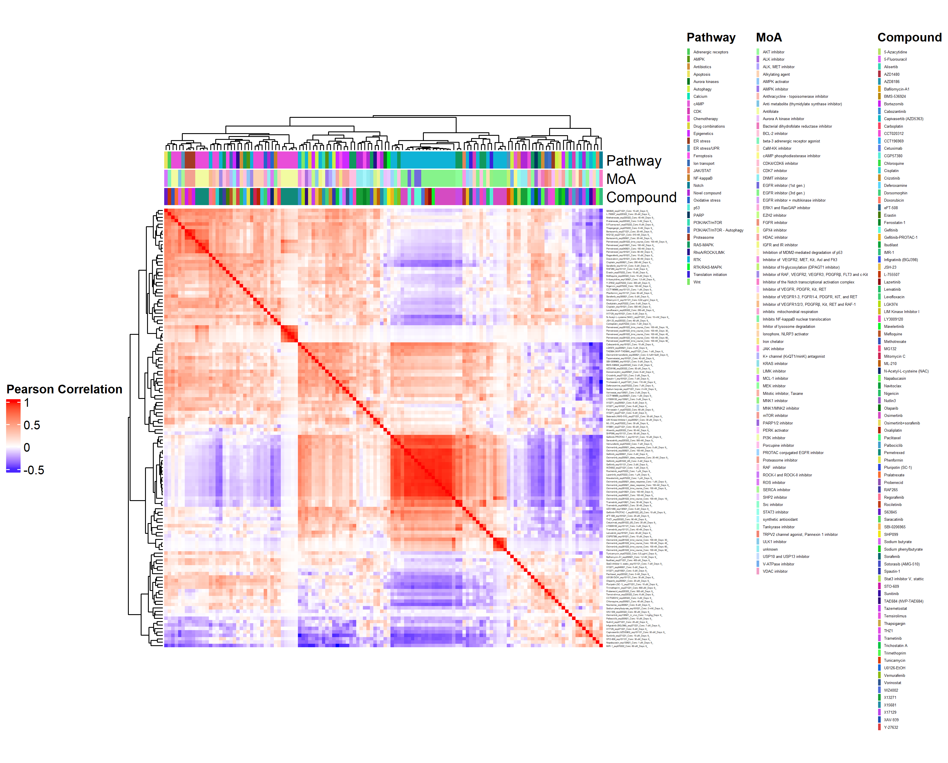
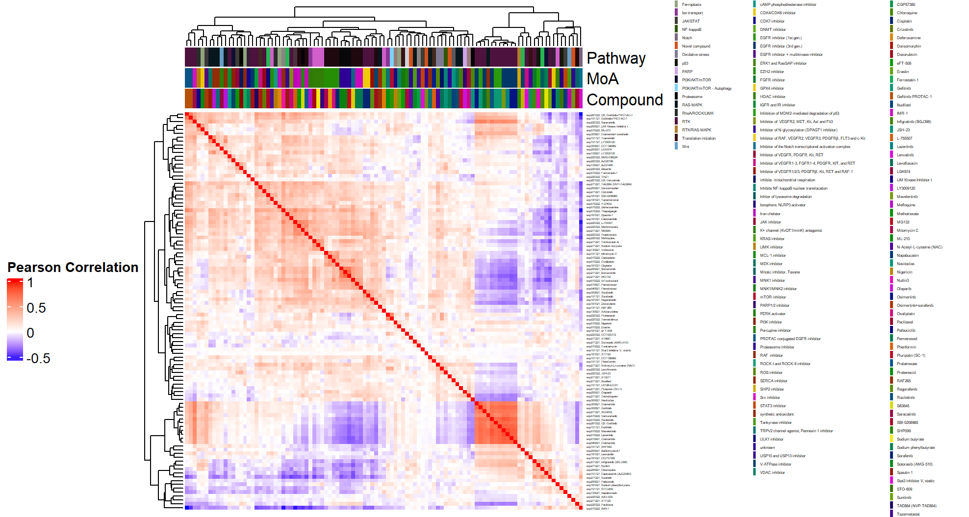
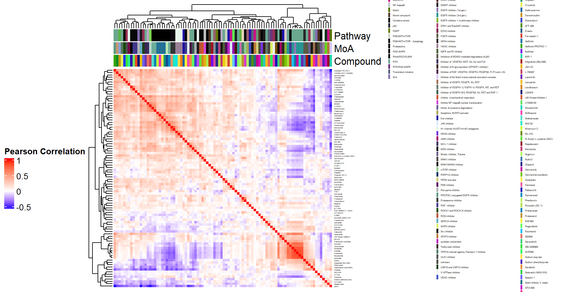
- Heatmap at the compound by batch level in Figure 3.2 (aggregated over technical replicates):
Drug-Drug Networks
Code
filename_drug_plot <- paste0("./figures/drug-drug networks/replicate-binarised-drug-drug_CC_0.2_", today_date)
filename_drug_data <- paste0("./results/drug-drug-similarity-scores/replicate-binarised-drug-drug_CC_0.2_", today_date)
n_pairwise_comparisons <- (ncol(DRB_binarised_replicate) * (ncol(DRB_binarised_replicate) - 1))/2
# setting a CC threshold of 0.2
igraph_binarised_replicates_CC_0.2 <- compute_drug_networks(DRB_binarised_replicate,
filename_drug_network_plot = filename_drug_plot,
filename_drug_network_data = filename_drug_data,
title_graph = "Drug by drug network, after binarisation",
graph_date = today_date,
pval_threshold = 0.05/n_pairwise_comparisons, # basic FWER approach
cor_threshold = 0.2,
export_graph = FALSE)
knitr::include_graphics(paste0(filename_drug_plot, ".png"),
dpi = 200, auto_pdf = TRUE)
# setting a CC threshold of 0.4
filename_drug_plot <- paste0("./figures/drug-drug networks/replicate-binarised-drug-drug_CC_0.4_", today_date)
filename_drug_data <- paste0("./results/drug-drug-similarity-scores/replicate-binarised-drug-drug_CC_0.4_", today_date)
igraph_binarised_replicates_CC_0.4 <- compute_drug_networks(DRB_binarised_replicate,
filename_drug_network_plot = filename_drug_plot,
filename_drug_network_data = filename_drug_data,
title_graph = "Drug by drug network, after binarisation",
graph_date = today_date,
pval_threshold = 0.05/n_pairwise_comparisons, # basic FWER approach
cor_threshold = 0.4,
export_graph = FALSE)
knitr::include_graphics(paste0(filename_drug_plot, ".png"),
dpi = 200, auto_pdf = TRUE)
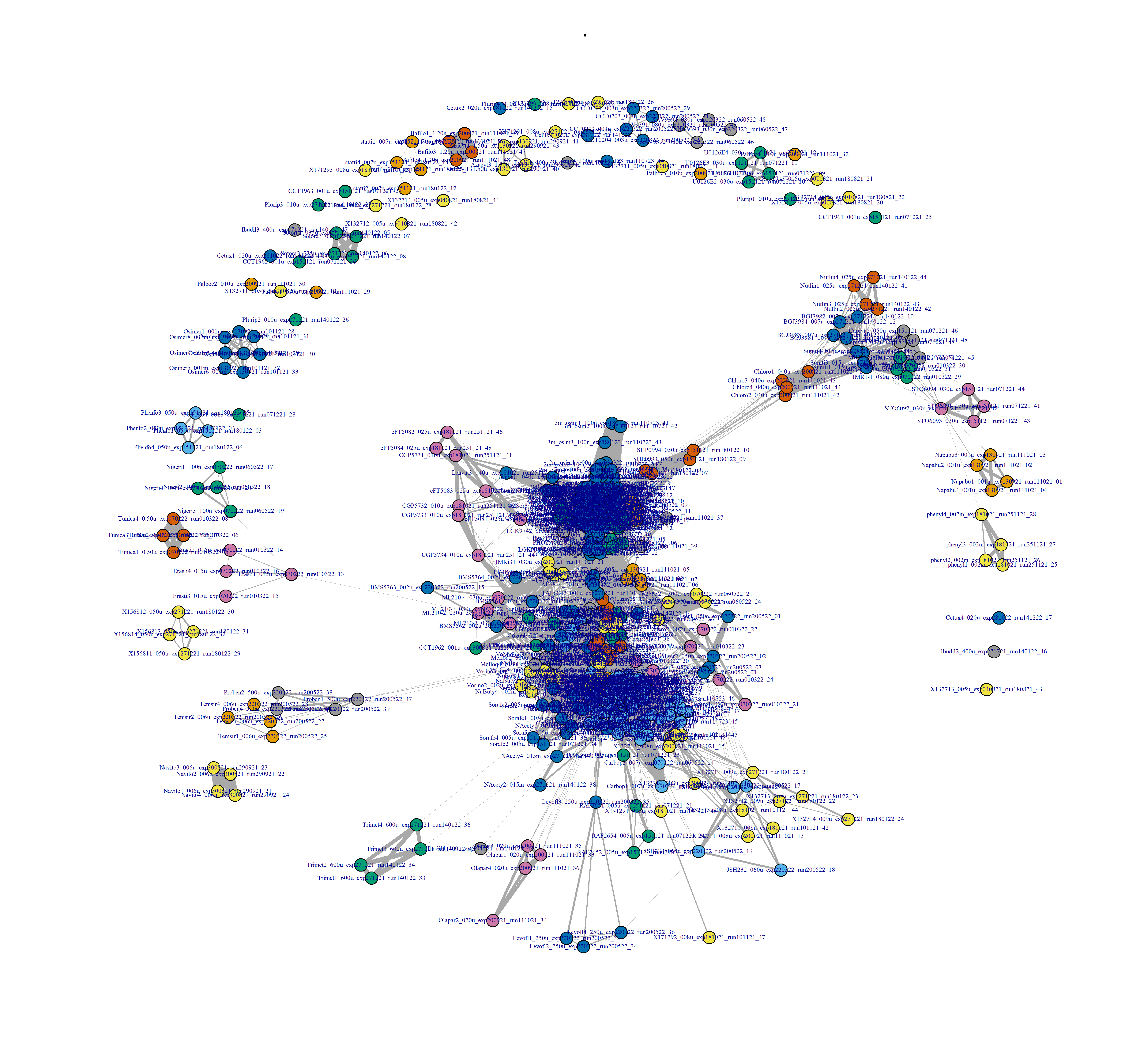
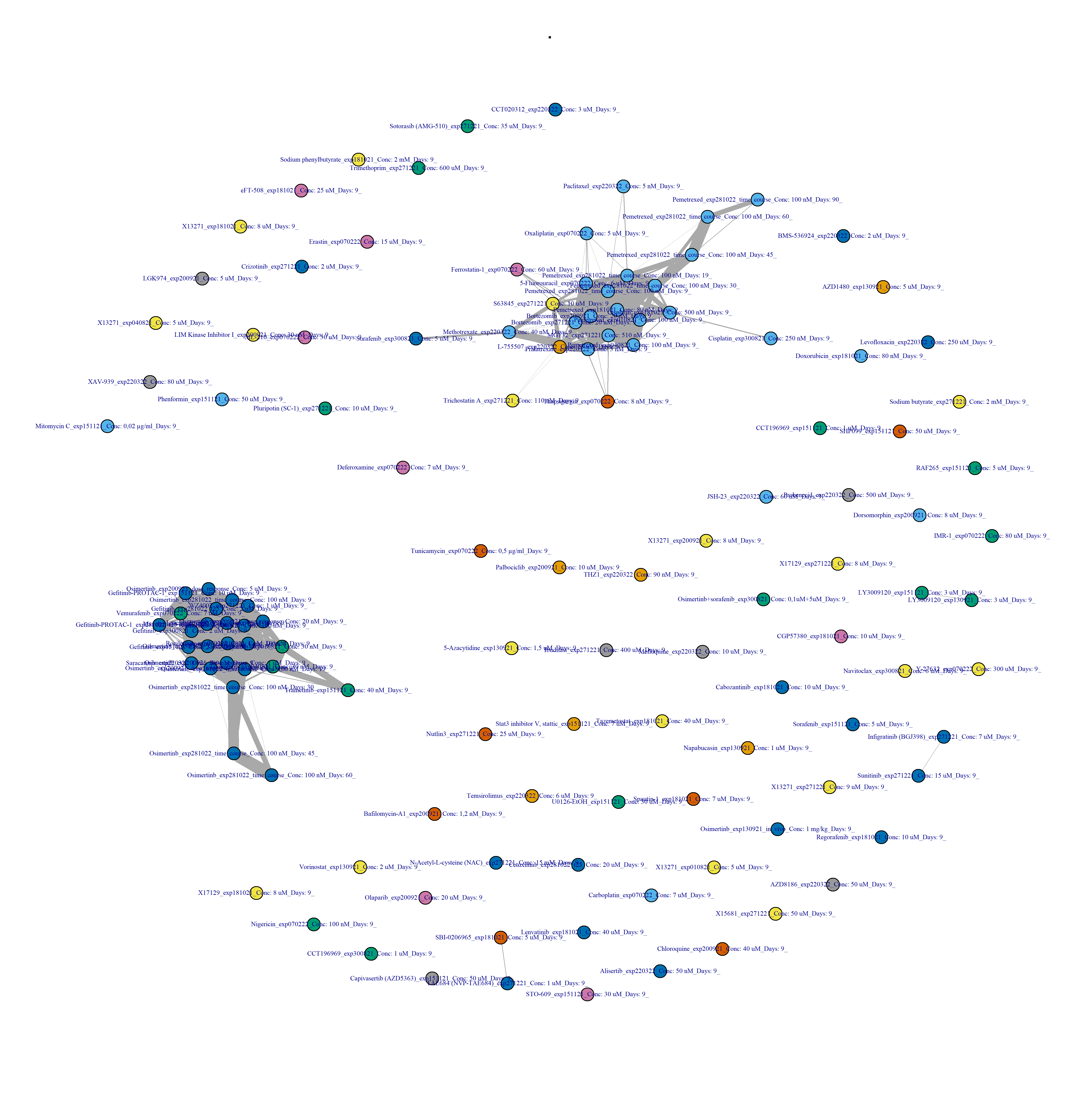
Figure 3.6: Drug-drug network, after binarisation, and at the replicate level.
Code
filename_drug_plot <- paste0("./figures/drug-drug networks/sample-binarised-drug-drug_CC_0.2_", today_date)
filename_drug_data <- paste0("./results/drug-drug-similarity-scores/sample-binarised-drug-drug_CC_0.2_", today_date)
n_pairwise_comparisons <- (ncol(DRB_binarised_samples) * (ncol(DRB_binarised_samples) - 1))/2
igraph_binarised_samples <- compute_drug_networks(DRB_binarised_samples,
filename_drug_network_plot = filename_drug_plot,
filename_drug_network_data = filename_drug_data,
title_graph = "Drug by drug network, after binarisation",
graph_date = today_date,
pval_threshold = 0.05/n_pairwise_comparisons, # basic FWER approach
cor_threshold = 0.2)
knitr::include_graphics(paste0(filename_drug_plot, ".png"),
dpi = 200, auto_pdf = TRUE)
filename_drug_plot <- paste0("./figures/drug-drug networks/sample-binarised-drug-drug_CC_0.4_", today_date)
filename_drug_data <- paste0("./results/drug-drug-similarity-scores/sample-binarised-drug-drug_CC_0.4_", today_date)
n_pairwise_comparisons <- (ncol(DRB_binarised_samples) * (ncol(DRB_binarised_samples) - 1))/2
igraph_binarised_samples <- compute_drug_networks(DRB_binarised_samples,
filename_drug_network_plot = filename_drug_plot,
filename_drug_network_data = filename_drug_data,
title_graph = "Drug by drug network, after binarisation",
graph_date = today_date,
pval_threshold = 0.05/n_pairwise_comparisons, # basic FWER approach
cor_threshold = 0.4)
knitr::include_graphics(paste0(filename_drug_plot, ".png"),
dpi = 200, auto_pdf = TRUE)
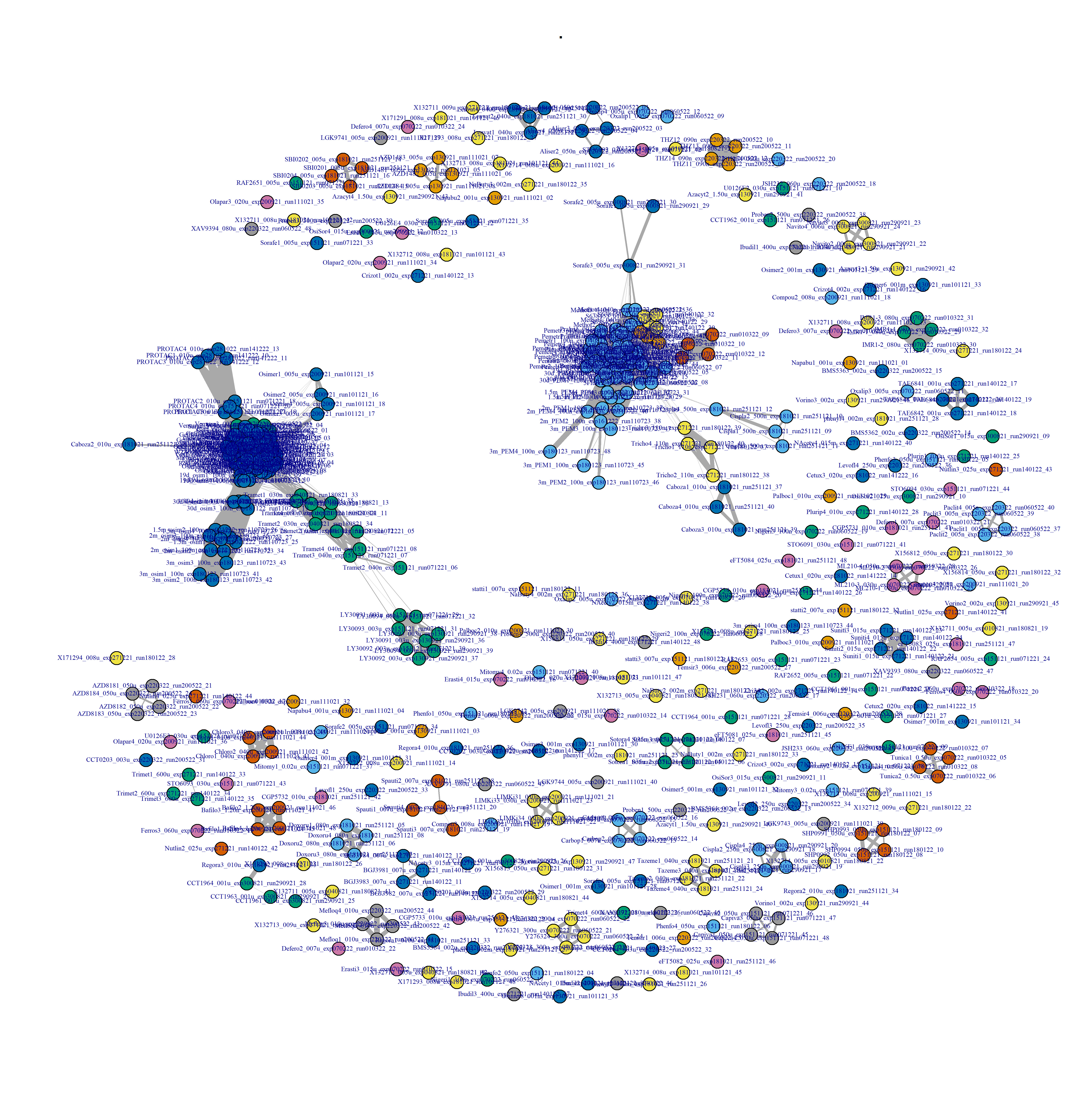
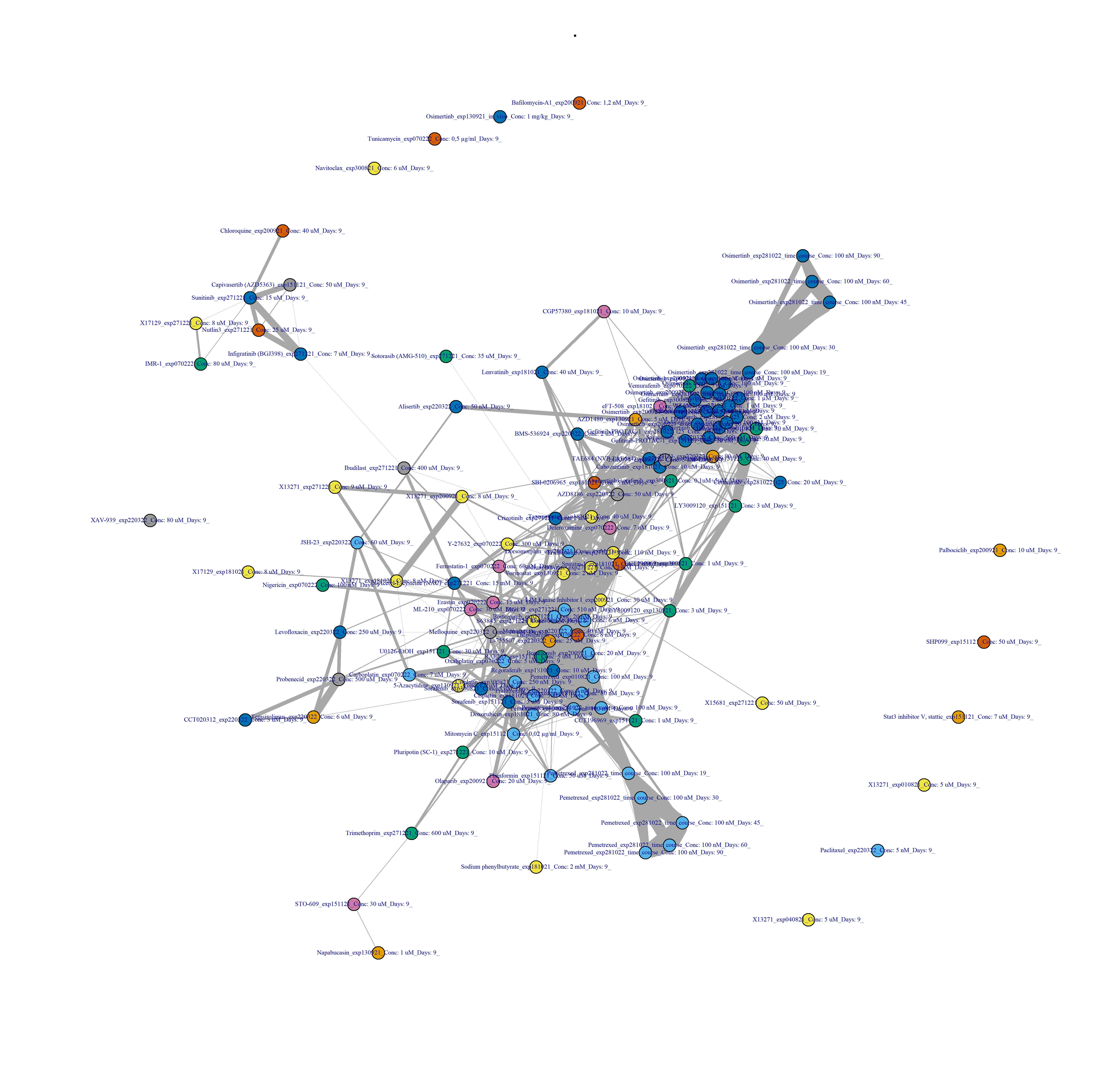
Figure 3.7: Drug-drug network interactions, at the compound level, and after binarisation.
Code
filename_drug_plot <- paste0("./figures/drug-drug networks/compound-by-batch-logCPM-drug-drug_CC_0.4_", today_date)
filename_drug_data <- paste0("./results/drug-drug-similarity-scores/compound-by-batch-logCPM-drug-drug_CC_0.4_", today_date)
n_pairwise_comparisons <- (ncol(DRB_logCPM_compound_by_batch) * (ncol(DRB_logCPM_compound_by_batch) - 1))/2
igraph_compound_by_batch_logCPM <- compute_drug_networks(DRB_logCPM_compound_by_batch,
filename_drug_network_plot = filename_drug_plot,
filename_drug_network_data = filename_drug_data,
title_graph = "Drug by drug network, after binarisation",
graph_date = today_date,
pval_threshold = 0.05/n_pairwise_comparisons, # basic FWER approach
cor_threshold = 0.4)
knitr::include_graphics(paste0(filename_drug_plot, ".png"),
dpi = 200, auto_pdf = TRUE)
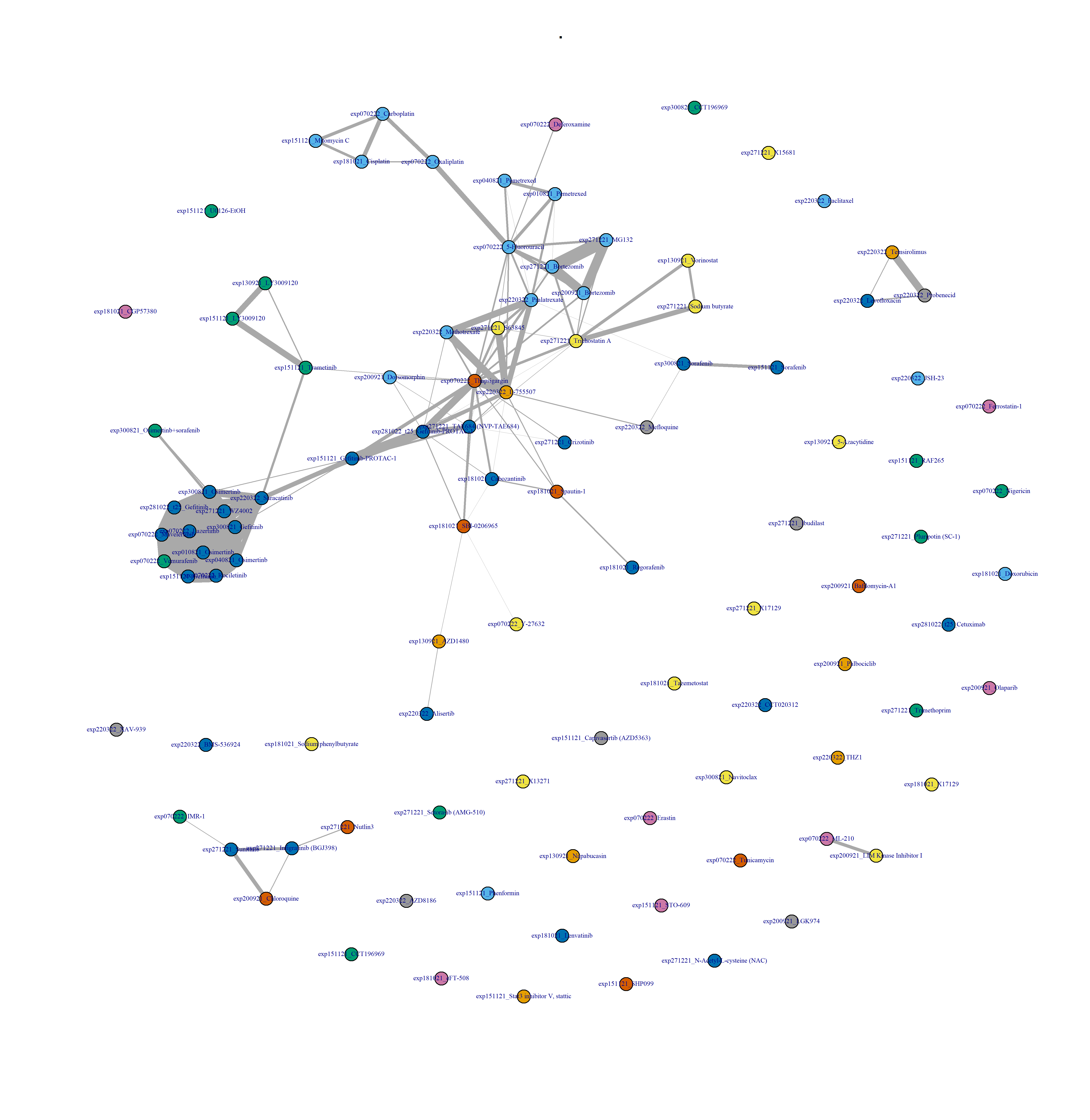
- Plot drug-drug graph with
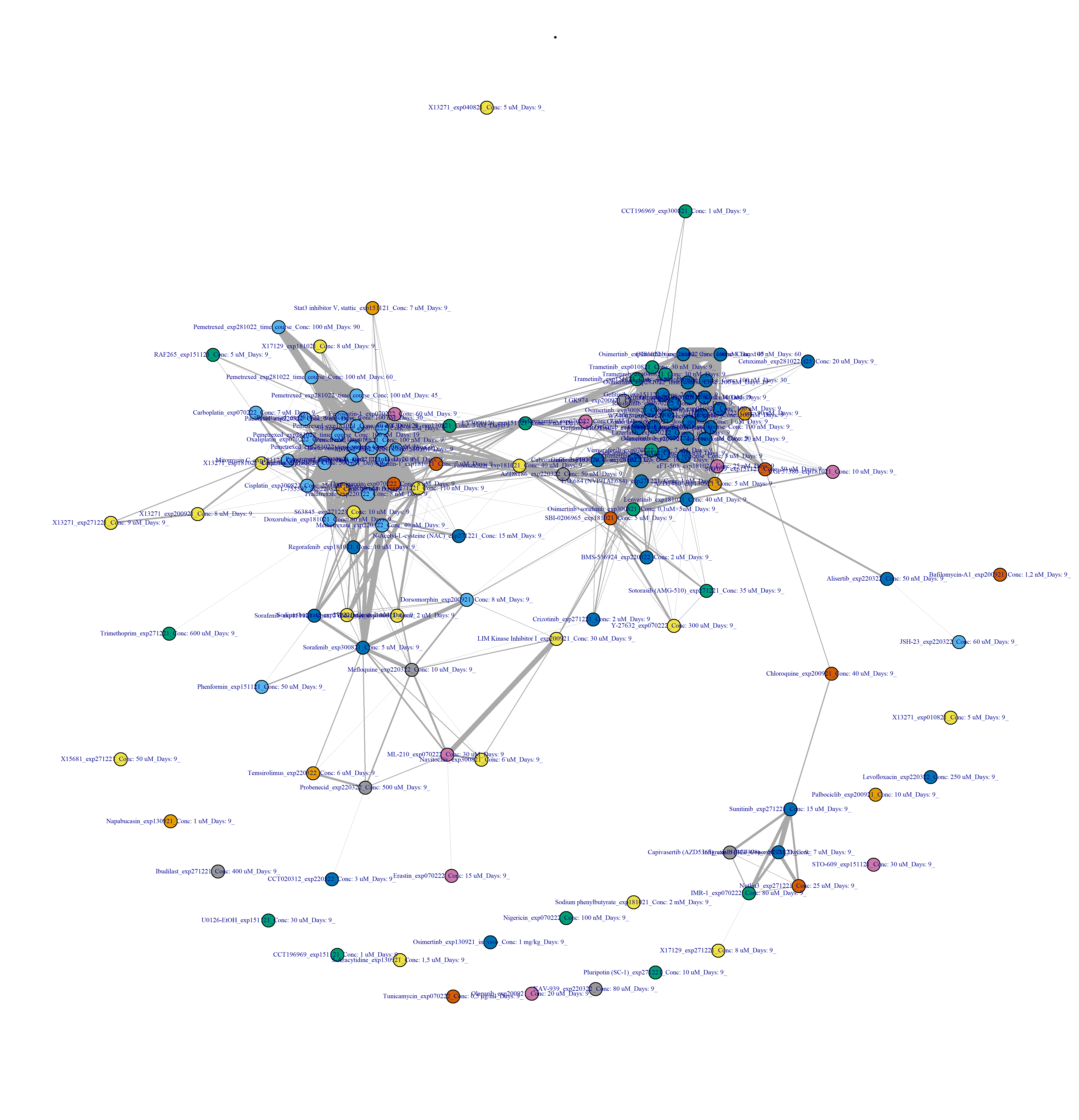
DESeq2 pipeline in Figure 3.9:
Code
filename_drug_plot <- paste0("./figures/drug-drug networks/compound-by-batch-DESeq2-drug-drug_CC_0.4_", today_date)
filename_drug_data <- paste0("./results/drug-drug-similarity-scores/compound-by-batch-DESeq2-drug-drug_CC_0.4_", today_date)
n_pairwise_comparisons <- (ncol(DRB_DESeq2_compound_by_batch) * (ncol(DRB_DESeq2_compound_by_batch) - 1))/2
igraph_compound_by_batch_DESeq2 <- compute_drug_networks(DRB_DESeq2_compound_by_batch,
filename_drug_network_plot = filename_drug_plot,
filename_drug_network_data = filename_drug_data,
title_graph = "Drug by drug network, after binarisation",
graph_date = today_date,
pval_threshold = 0.05/n_pairwise_comparisons, # basic FWER approach
cor_threshold = 0.4)
knitr::include_graphics(paste0(filename_drug_plot, ".png"),
dpi = 200, auto_pdf = TRUE)
Find top hits
-
Reactable framework applying the binarisation pipeline:
Code
# Returns all shared neighbours for Pemetrexed, in a network-centric approach
# binarised_graph <- igraph_binarised_samples$igraph_object
# Pemetrexed_vertices <- igraph::V(binarised_graph)[grepl("Pemetre", name)]
# neigh_list <- lapply(Pemetrexed_vertices, function(v)
# igraph::neighbors(binarised_graph, v = Pemetrexed_vertices))
# do.call(igraph::intersection, neigh_list)
filename_scores <- paste0("./results/top_hits/top_hits_binarised_batch_by_sample_", today_date)
top_hits_binarised <- tidy_drug_scores(adjacency_list = igraph_binarised_samples,
filename_scores = filename_scores)
flextable::flextable(head(top_hits_binarised)) |>
bold(part = "header")
drug_one |
drug_two |
cor_pearson |
adj_pval |
5-Azacytidine_exp130921_Conc: 1,5 uM_Days: 9_ |
Mefloquine_exp220322_Conc: 10 uM_Days: 9_ |
0.1856885 |
0.00000000000000000000 |
5-Azacytidine_exp130921_Conc: 1,5 uM_Days: 9_ |
Doxorubicin_exp181021_Conc: 80 nM_Days: 9_ |
0.1500400 |
0.00000000000000000000 |
5-Azacytidine_exp130921_Conc: 1,5 uM_Days: 9_ |
Vorinostat_exp130921_Conc: 2 uM_Days: 9_ |
0.1468345 |
0.00000000000000000000 |
5-Azacytidine_exp130921_Conc: 1,5 uM_Days: 9_ |
Cisplatin_exp300821_Conc: 250 nM_Days: 9_ |
0.1366823 |
0.00000000000000000000 |
5-Azacytidine_exp130921_Conc: 1,5 uM_Days: 9_ |
Crizotinib_exp271221_Conc: 2 uM_Days: 9_ |
0.1301176 |
0.00000000000000000000 |
5-Azacytidine_exp130921_Conc: 1,5 uM_Days: 9_ |
Y-27632_exp070222_Conc: 300 uM_Days: 9_ |
0.1142308 |
0.00000000000001865175 |
Code
compute_Reactable_drug_pairs(top_hits_binarised,
Reactable_title = "Top drug pairs applying the binarisation pipeline",
csv_filename_drug_pairs = "drug-pairs-binarised-batch-by-compound.csv")
Top drug pairs applying the binarisation pipeline
-
Reactable framework applying the logCPM pipeline:
Code
filename_scores <- paste0("./results/top_hits/top_hits_logCPM_", today_date)
top_hits_logCPM <- tidy_drug_scores(adjacency_list = igraph_compound_by_batch_logCPM,
filename_scores = filename_scores)
flextable::flextable(head(top_hits_logCPM)) |>
bold(part = "header")
drug_one |
drug_two |
cor_pearson |
adj_pval |
5-Azacytidine_exp130921_Conc: 1,5 uM_Days: 9_ |
Regorafenib_exp181021_Conc: 10 uM_Days: 9_ |
0.4795476 |
0 |
5-Azacytidine_exp130921_Conc: 1,5 uM_Days: 9_ |
Vorinostat_exp130921_Conc: 2 uM_Days: 9_ |
0.4541214 |
0 |
5-Azacytidine_exp130921_Conc: 1,5 uM_Days: 9_ |
RAF265_exp151121_Conc: 5 uM_Days: 9_ |
0.4534550 |
0 |
5-Azacytidine_exp130921_Conc: 1,5 uM_Days: 9_ |
Cisplatin_exp300821_Conc: 250 nM_Days: 9_ |
0.4499427 |
0 |
5-Azacytidine_exp130921_Conc: 1,5 uM_Days: 9_ |
Mefloquine_exp220322_Conc: 10 uM_Days: 9_ |
0.4471234 |
0 |
5-Azacytidine_exp130921_Conc: 1,5 uM_Days: 9_ |
Erastin_exp070222_Conc: 15 uM_Days: 9_ |
0.4143518 |
0 |
Code
compute_Reactable_drug_pairs(top_hits_logCPM,
Reactable_title = "Top drug pairs applying the logCPM pipeline",
csv_filename_drug_pairs = "drug-pairs-logCPM.csv")
Top drug pairs applying the logCPM pipeline
-
Reactable framework applying the DESeq2 pipeline:
Code
filename_scores <- paste0("./results/top_hits/top_hits_DESeq2_", today_date)
top_hits_DESeq2 <- tidy_drug_scores(adjacency_list = igraph_compound_by_batch_DESeq2,
filename_scores = filename_scores)
flextable::flextable(head(top_hits_DESeq2)) |>
bold(part = "header")
drug_one |
drug_two |
cor_pearson |
adj_pval |
exp010821_Osimertinb |
exp070222_Mavelertinib |
0.7925470 |
0 |
exp010821_Osimertinb |
exp070222_Lazertinib |
0.7871005 |
0 |
exp010821_Osimertinb |
exp040821_Osimertinb |
0.7855120 |
0 |
exp010821_Osimertinb |
exp151121_Gefitinib |
0.7669585 |
0 |
exp010821_Osimertinb |
exp070222_Rociletinib |
0.7505062 |
0 |
exp010821_Osimertinb |
exp300821_Gefitinib |
0.7222924 |
0 |
Code
compute_Reactable_drug_pairs(top_hits_DESeq2,
Reactable_title = "Top drug pairs applying the DESeq2 pipeline",
csv_filename_drug_pairs = "drug-pairs-DESeq2.csv")
Top drug pairs applying the DESeq2 pipeline
Compute Cell Lines Similarities
Cell Line By Cell Line Heatmap